From the first pinhole camera to today's smart phone camera, photography has always been an important part of lives - from storing memories to capturing a hilarious moment. Turning your favorite photos into great pieces of art for tshirts can be somewhat of a challenge. Simply throwing a huge square or rectangular photo onto a tshirt doesn't usually cut it. Here's some featured "photo real" tees to give you some inspiration and to help you avoid the awful, blunt edges of basic photo real tees.
Manipulated Photography
Cool Cat by Dzeri29
This photo real cat has got some serious attitude! This designer combined a cut-out photo of a cat with matching sunglasses and headphones that gives it a modern, yet retro feel. Cutting out the main photo and manipulating it with other cutouts was key to making this design successful - if this design was simply a square photo of a cat posted on a tshirt, it just wouldn't look the same.
Black Bear by RLMarkossa
Designer RLMarkossa tackled black and white photography in the killer design where he manipulated photos of a black bear, sunglasses and a snapback. A large texture and even a photo filter may have been placed on the photo of the bear to give him the cool look he's got. With black and white photos, its important to make sure your photo has black blacks and white whites, or it all just looks like a muddled grey. This design has done a great job with that, especially in the highlights in the bear's fur and on the sunglasses.
Cool Burger by Jublin
This design is making me hungry...Jublin combined an awesome photo of a cheeseburger with sunglasses to create one funny piece of art. What makes this design great is the clarity of the photo that really brings out the details in the burger - it really sells the design as being photo-realistic. Just looking at this burger would make anyone drool!
Art and Photography
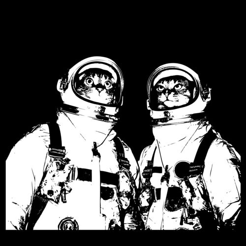
Catstronauts by MasterControl
Castronauts has been a top seller here at DBH, and it's easy to see why. Who doesn't love cats in astronaut suits? This design combines some super realistic cat photography with some artistically made astronaut suits. The black and white coloring also give it a retro feel that really stands out. This design is a great example of incorporating artistic elements with your photography.
Pixel Overload by Nicebleed
8-bit colors have met their match in Pixel Overload. This designer combined two really great ideas here - a black and white retro photograph with some modern day pixelated coloring. The design works so well because audiences can understand the retro concept and old tv paired with the 8-bit coloring. The bright colors against the dark background and TV also make the design pop, and its sure to stand out on any tshirt.
Type and Photography
Dreaming'¦ by NeonTiger
This California-themed design takes some amazing photos of the Golden State and imposes them into type, which has created a pretty amazing design. This artist took his type one step further by adding background behind the letters, which also creates a geometric look. While this design slightly border on the "pasting just a square photo onto a tshirt", the geometric look and offset photos, along with the rectangular nature really make this design successful.
Stop Extinction by Dzeri29
Stop Extinction has also done pretty well here at DBH. This artist has incorporated a lot of realistic elements that create an impressive look. First, type has been warped and stretched to create a panda's head and fur texture was added to give it that photo-realistic look. Other elements such as the panda's nose and eye are also very photo-realistic and sell the design.
Photographic Collage
The Group by drewbm
This black and white collage is quite abstract, featuring photos of African wildlife (like gazelles), mixed with high-class society. We're sure there's some major social class commentary buried in here, but we're digging the overall photo collage. There's a subtle art to adding animal heads to human bodies - making sure the head size is accurate is key.
Cities - William Henry by billpyle
This black and white photo collage incorporates type and photo-realism. The juxtaposed skyscrapers create a geometric look that almost looks like an illusion. There's a ton of detail in the buildings that makes this design work. A slight grunge texture was added to give the buildings and type some depth instead of just appearing flat.
Photo-realism is a great way for artists to showcase their photography skills, or their collage-making skills. Photo-realism can really make a design stand out above the rest, simply because details can really make a difference. One important thing to remember is to use your OWN photography, or make sure to pay for the photos. Good Luck on your next project!


